
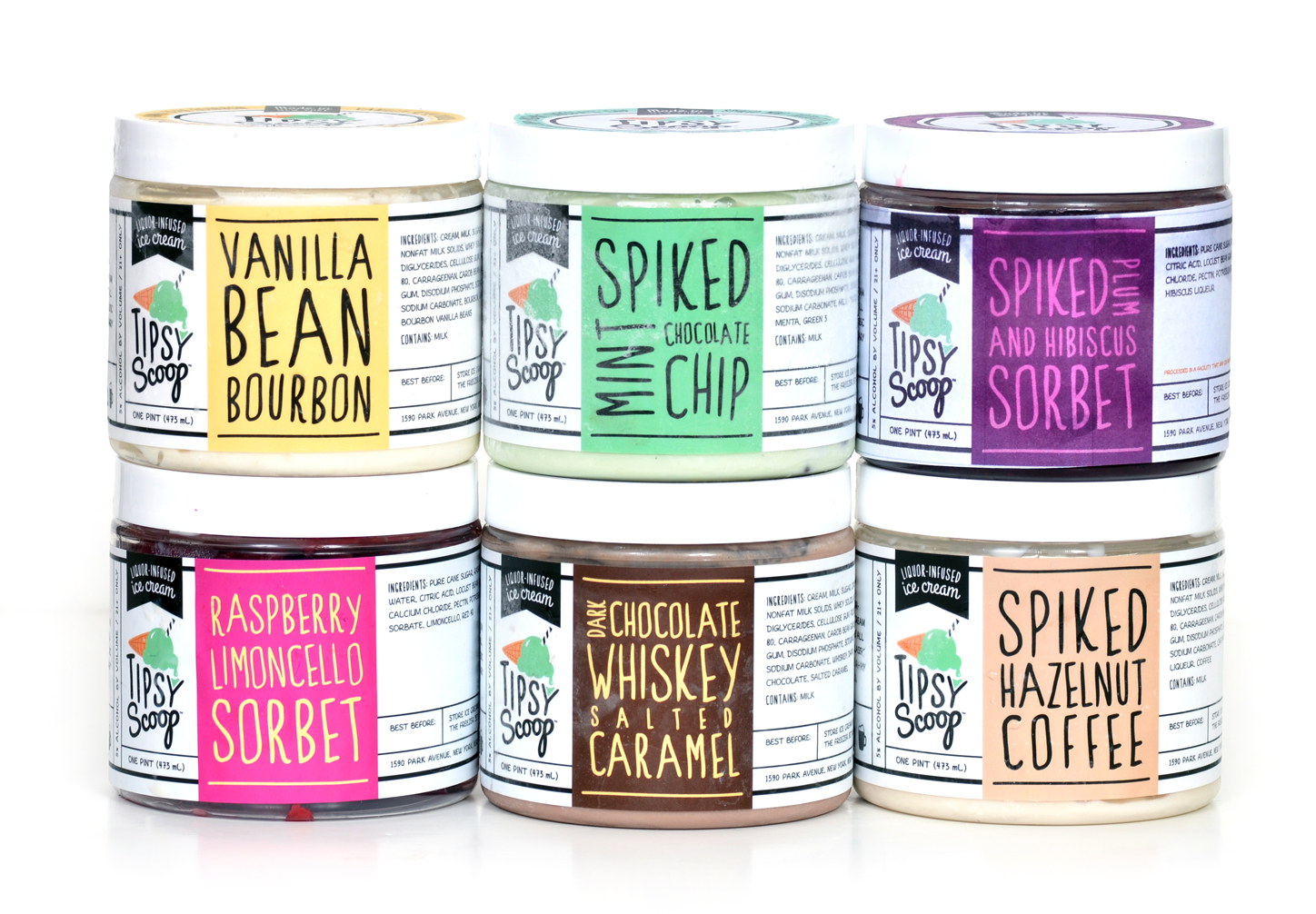
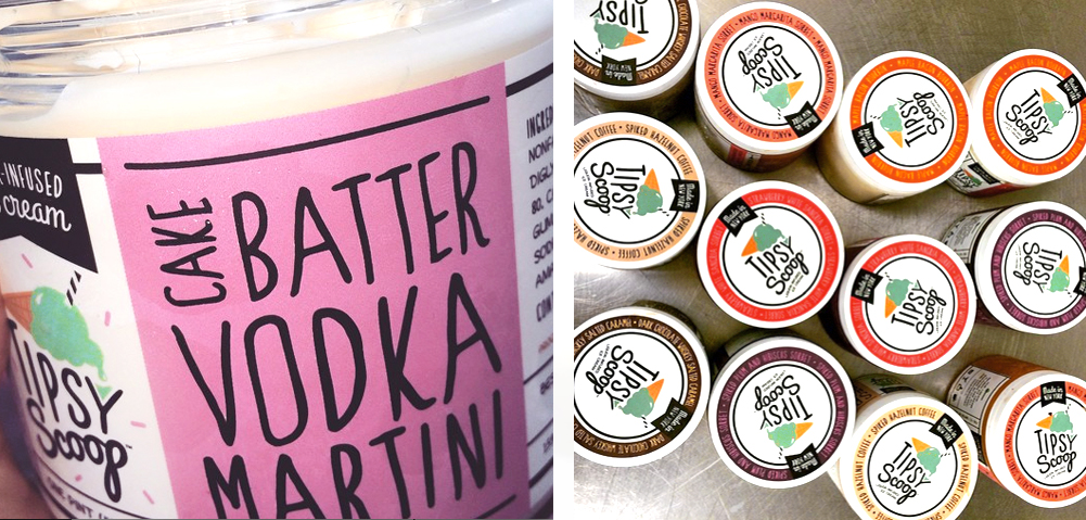
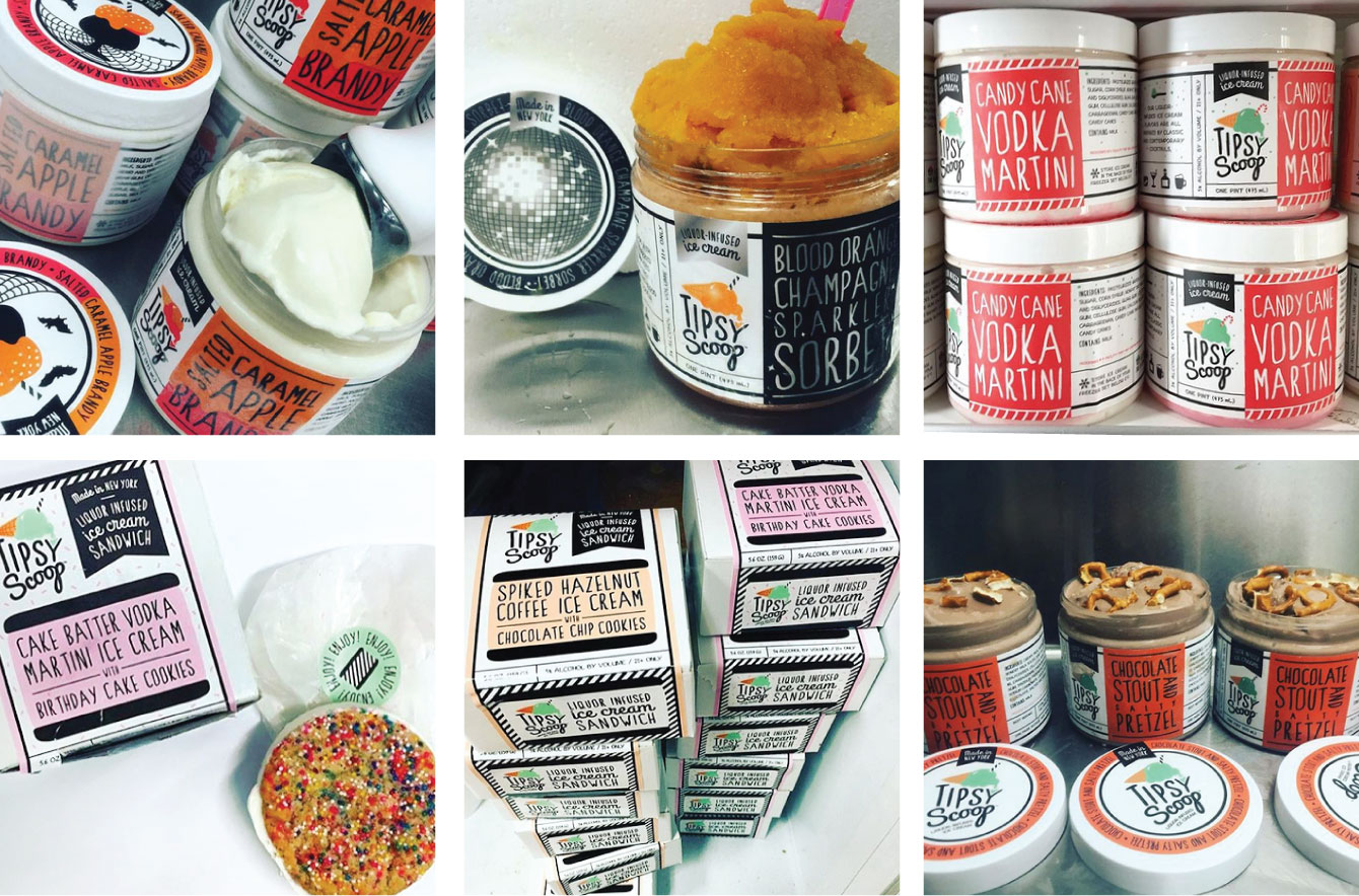
Tipsy Scoop was looking to update their overall brand with a new logo and website. We came up with a logo that still fit the company’s fun vibe but cleaned it up with a more polished, yet playful, look that speaks to their audience.
We then rolled out their new packaging and website as well. The packaging has been such a hit, customers are not only commenting on the flavor of the ice cream but are also excited to show off their Tipsy Scoop pints, posting photos commenting on the new design.
The complete redesign of their website updated their look along with making it much easier for the customer to use. You can check it out at tipsyscoop.com.![]()
–––––––––––––––––––––––––––––
“I was hesitant to change my logo and branding…after discussing with Jodi and taking her advice and guidance, she worked on a new logo for me that really captured the essence of my brand. She was able to create something for Tipsy Scoop that is fun and playful and really took my brand to the next level!…
I now see that people are not only commenting on the flavor of my ice cream, but are constantly complementing the look of the packaging! Several people have said they ended up keeping the pints afterwards just because they liked how they looked.”
– Melissa Tavss, founder / owner Tipsy Scoop
–––––––––––––––––––––––––––––
–––––––––––––––––––––––––––––
“Jodi’s work on my logo, website design and packaging have allowed my company to grow tremendously! I have certainly seen an increase in sales on my website.”
– Melissa Tavss, founder / owner Tipsy Scoop
–––––––––––––––––––––––––––––